WMAP 2009 comparison versus Planck 21 March 2013

WMAP 2009
Temperature -215 to 206
Picture 1
Planck Scale 1 to 1
Temperature -514 to 517
Picture 2
WMAP 2009
Temperature -500 to 500
Picture 3
Planck Scale 1 to 1
Temperature -500 to 500
Picture 4

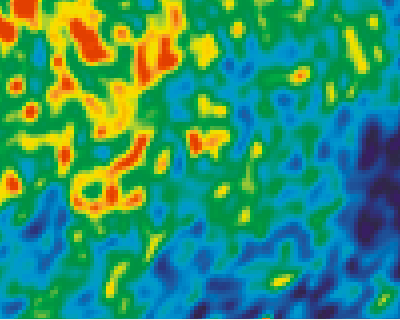
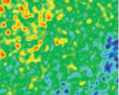
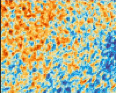
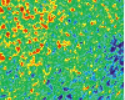
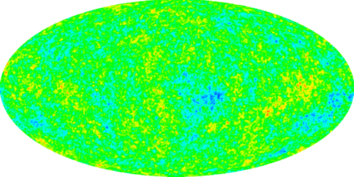
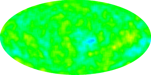
All the images are from the same area in the sky. The enlargement is 400 %
Picture 1 and Picture 2 are the raw pictures. The colour schemes of both pictures is different and are explained below.
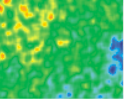
Picture 3 and Picture 4 are the modified pictures. The colour scheme of both pictures is the same.

        0,0  ---------- 1024,0                860,240 -------- 960,240
         |                 |                    |               |
         |                 |                    |               |
         |                 |                    |               |
       512,0 ---------- 1024,512              860,320-------- 960,320  
         
            Source Picture                      400 % enlargement
                                 Figure 1
The source pictures have the size of 1024*512 pixels. The raw pictures have a size of 100*80 pixels. Enlargement of 400% means that their size increases to 400*320 pixels.

Figure 1 shows the position of the pictures. The top left corners has the coordinates 860,240. The bottom right corner has the coordinates 960,320.

The highest value of the Planck Picture 2 (and Picture 4) is at coordinate 879,247. This point has a temperature of 517 micro Kelvin. This is the brown point near the top left corner

For a copy of the WMAP 2009 source file go to: Ilc_9yr_moll4096.png
For a copy of the Planck source file go to: 735683main_pia16873-full_full.jpg


Picture comparison

When you compare Picture 3 with Picture 4 the difference is striking.


Filters

A different way to compare the pictures is by using a filter.
The strategy is to consider a square of for example 3 by 3 pixels. To calculate the temperature of each pixel. To add them all up and to calculate the average. This will be the temperature and the colour of the pixel in the center.
This strategy is done for all the pixels. When a grid of 3 by 3 is considered than this is called a scale of 3 to 1 .
Plank Scale 3 to 1
Temperature -490 to 431
Picture 3
Planck Scale 5 to 1
Temperature -446 to 323
Picture 4


CMBR pictures

The following three pictures are representations of the total sky.
Planck Scale 1 to 1
Temperature -514 to 517
Picture 5
Planck Scale 5 to 1
Temperature -446 to 323
Picture 6
Planck Scale 25 to 1
Temperature -307 to 163
Picture 7
What is important that the colour schemes are identical which makes them easy to compare.


Colour Investigation

The biggest problem is to convert source colours to temperatures to destination colours. In order to calculate the temperature of the planck 2013 data you have to visit: http://planck.caltech.edu/pub/2013results/Planck_2013_results_01.pdf the top of page 25 ( Planck Collaboration: The Planck mission )
The temperature range goes from -500 to 500. There are 5 regions
 
  Red         0        0    255    255    255    103
 Green        9       221   237    180     75     0
  Blue       255      255   217     0       0     0
 colour      blue          white          red   brown 
temperature -500     -177   -6     161    329    500   
region           1         2     3      4      5
            Planck Source Colour Scheme
                    Figure 2
The colour of the Planck picture consists of 4 regions and 5 colours: blue(cold), cyan, green, yellow and red(warm)

The destination colours of the Planck pictures follow a lineair scheme.

  Red                                       0    128   255   255    255   128
 Green              0    128   255   255   255   255   255   128     0     0
  Blue       128   255   255   255   128    0     0
 colour           blue        cyan        green       yellow        red
temperature -500  -400  -300  -200   -100   0    100   200   300    400   500
  region              1          2          3            4
                     Planck/WMAP Destination Colour Scheme
                                 Figure 3
The colour of the Planck picture consists of 4 regions and 5 colours: blue(cold), cyan, light, yellow and red(warm)
The scheme is only an approximation
The Planck Source scheme use for each temperature 3 colours. The Planck destination scheme 2. The WMAP 2009 colour scheme resembles the Planck destination scheme but also uses for each temperature 3 colours. At the blue side it also uses the colour black.

In order to calculate the temperature of the planck 2013 data you have to visit: http://arxiv.org/abs/1212.5225 the top of page 89 ( 9 Year WMAP Observations: Final Maps and Results )
The temperature range goes from -200 to 200. There are 9 regions

 
   Red        33   20    2     8   30   32    3   142  236  226  182
 Green        14   63  130   150  162  161  145   185  221  142   26
  Blue        96  132  196   203  183  168   72    12    5   33   26
 colour      blue          
temperature -200 -115  -35   -18    9   18   61   114  143  178  200
region           1      2     3      4      5   6     7    8    9
            WMAP 2009 Source Colour Scheme
                      Figure 4


CMB radiation Power Spectrum Calculation

The most vivid explanation of the CMB Power Spectrum is by Edward L. Whight in the document: Cosmic Microwave Background Anisotropy .
Here you can read: "The angular power spectrum APS of the anisotropy of the CMB contains information about the Universe. This APS is a plot of how much the temperature varies from point to point. Ell=10 means that there are ten cycles in the fluctuation around the whole sky, while ell=100 means that there are 100 cycles around the sky.
That means that the CMB radiation sky map is a superposition from all the individual sky maps from l = 2 to l = 1000. The question is what is involved to calculate the sky map for each individual l value.
That this calculation is very difficult becomes clear

A simpler case is to study not the whole sky but a circle. In that case the CMB radiation is a superposition/summation for l = 1 to 100 for alpha going from 0 to 360 of the function:
R(l)*sin(l * alpha * pi/180 + beta(l)).
These are "open" harmonic waves. See also Harmonic The circles studied follow a meridian, that means they go through the North and South pole.
The following documents show this data in increments of 0.25 degrees:
WMAP database 10.htm , Planck database 10.htm , WMAP database 45.htm , Planck database 45.htm , WMAP database 90.htm , Planck database 90.htm
The layout for each html file is the following:
(Html)
(PRE)
WMAP database 45.htm
 0             198,039215686275 

 1039          73,8546457699606 
(/PRE)
(/HTML)
Figure 5
Instead of ( read < . Instead of ) read <
WMAP 45 Source
Picture 8
Picture 8 shows the 1440 values of the file : "WMAP database 45.htm". The value 45 is the hour angle in degrees.
WMAP 45 Simulation
Picture 9
Figure 9 shows the simulated curve of the file : "WMAP database 45.htm". The number of l values calculated is 61. In that case 61 R values and 61 Beta values have to be calculated.
  1. The program starts with initial R values of 0 and intial Beta values of 0. This are also called the old R and Beta values.
  2. Next delta_R and delta_Beta are calculated.
    delta_R values are random numbers between -0.5 and +0.5. delta_Beta values are random numbers between -0.25 and +0.25.
  3. New R values are calculated using R new = R old + delta_R. The same with new Beta values.
  4. Using R(l)*sin(l * alpha * pi/180 + beta(l)) and with alpha going from 0 to 1439 a new WMAP function is calculated.
  5. At the same time an Error is calculated, with is the difference between the value in the source file (for that angle) and the calculated WMAP value. That Error value is squared. And a total Error value is updated.
  6. When all the 1440 WMAP values are calculated the new_Total_Error value is compared with the old_Total_Error Value. When the new value is larger nothing happens. When the new value is smaller the old R values are replaced with the new R values. The same for the old Beta values.

WMAP 45 Database Detail
Figure 6
WMAP 45 R and Beta
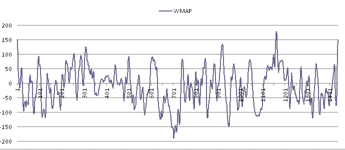
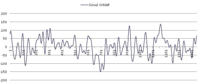
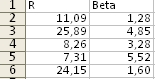
Figure 6 show the R and Beta values of 4 different simulations of the file : "WMAP database 45.htm" for l going from 1 to 61.
When you compare the 4 different values for R they are rather similar. The same for the beta values.
  • Figure 7 shows the combined R results for 2 WMAP and 4 Planck simulations for l = 1 to 20.
  • The 2 WMAP simulations are for the Hours 10 and 45.
    The 4 Planck simulations are for the Hours 10, 45 and 90
  • Each column with R values is a combination of 4 different simulations.
  • For example column 3 "WMAP 45" shows the combined results of the data in Picture 10 and 11
When you compare the results of both WMAP and Planck for Hour = 10 than they are almost identical
The same for the WMAP and Planck results for Hour = 45.
But when you compare the results for Hour = 10 and Hour = 45 than they are different.
This is more or less as expected because the WMAP and Planck results are generally speaking identical, but if you compare the results for different meridians than they are different.
l WMAP 10 Planck 10 WMAP 45 Planck 45 Planck 45* Planck 90
1 33,59 44,06 9,32 11,27 12,63 30,56
2 24,14 42,97 24,36 46,48 36,54 4,93
3 6,62 5,06 8,96 9,16 5,18 11,04
4 23,26 19,65 9,11 10,11 4,31 12,31
5 6,71 3,20 26,90 27,36 24,14 18,59
6 21,00 22,59 6,57 4,60 6,14 25,91
7 9,94 10,66 5,59 6,72 2,15 16,66
8 9,98 14,89 19,01 17,37 13,15 10,41
9 22,29 30,17 4,72 16,91 10,17 16,03
10 1,20 8,08 15,77 16,80 11,96 10,63
11 3,79 12,39 18,59 14,29 14,35 2,10
12 4,87 7,56 3,44 1,26 4,42 7,38
13 28,36 36,73 2,13 9,16 5,50 13,59
14 12,13 25,56 14,32 18,62 10,85 7,81
15 16,08 22,69 3,44 47,00 2,23 22,40
16 4,85 7,75 4,04 3,45 6,46 12,98
17 0,46 2,56 5,95 13,08 12,88 14,10
18 15,44 19,98 6,48 5,14 4,89 18,19
19 1,11 8,85 19,40 13,59 17,88 18,59
20 3,39 2,96 9,86 13,22 10,68 7,56
R values
Figure 7
WMAP 10 38,07
Planck 10 94,28
WMAP 45 41,35
Planck 45 111,62
Planck 45* 91,51
Planck 90 98,91
Average error values
Figure 8
  • Figure 8 Show the average error values for 2 WMAP simulations and 4 Planck simulations for 3 different Hour values.
  • In most cases l goes from 1 to 60. In Planck 45* l goes from 1 to 500.
The reason that the average error for the Planck results is higher (compared with the WMAP results) comes because the positiv temperature values are higher and the negatif values are lower. Specific the peaks are higher and the valleys are lower.

The Planck 45* value is lower than the Planck 45 value because much more sinus functions are included (500 compared to 60)

The power spectrum of the whole sky shows an almost continuous curve for l going from 1 to 1500 with a clear peak at roughly l = 500.
Such a peak is not observed in the simulated sinus functions for each meridian.

When you study the results the question arises: What is the physical interpretation of each of these sinus functions.
IMO none. They have no physical meaning. They are not real. They do not describe a physical effect. It is only pure mathematics.
To claim that the sinus functions are Baryonic Acoustic Oscillations is not obvious.

The only exception is when you modify the function slightly and R(0) is included.
For the results see: Comparison with R(0)
For the WMAP results there is almost no difference
For the Planck results there is a difference because R(0) is negative. The CMB radiation images are fluctuations around an average temperature of 2.725 Kelvin. A negative value of R(0) means that this average value should be lower.

You could also perform the same exercise around earth as a function of the distance above and below sea level and calculate the same harmonic waves. Also for these harmonic waves there is no physical interpretation.


Doppler Boosting

One aspect which can be used to explain the above mentioned sinus functions is Doppler Boosting.
For a description of this phenomena read this: Planck 2013 results. XXVII. Doppler boosting of the CMB: Eppur si muove
IMO Doppler boosting can only be used for l = 1, assuming it is not taken into account. That means only for the function: R(1) * sin( alpha * pi/180 + beta(1))


Reflection

The most striking result of the Planck data is that there are many more hot and cold spots compared with the 9 year WMAP data.
See For example 7 Year WMAP probe observations: Cosmological Interpretation
The two most important question to answer are:

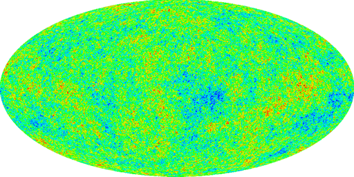
The colour of each pixel represents the wave length (or frequency) of the (CMB) radiation received. The colour red means: high temperature and high wave length (relative). Blue means low temperature and low wave length
However this raises a problem when you compare WMAP with Planck data.
When you consider the left corner of picture 3 you will see that this is an area with high temperatures. When you consider the same corner of picture 4 then you will see that this is also an area with high temperatures but the values are much higher.
That means that each pixel receives a range of photons with different wave lengths.The conclusion is that the final colour of each pixel represents an average of the received wave lengths.
The same is true for the low temperatures. For example the bottom right corner of Picture 3 and Picture 4.
The reality is that from each position in the sky we receive CMB radiation within a range of frequencies.

This fact makes the physical interpretation much more difficult. The frequencies outside the average value should also be included and they can be important to calculate the cosmological parameters. In fact they make the calculation more difficult.
This is different when you consider star light. For star light the main parameter is intensity. That means all photons of all frequencies are considered. You can also study the temperature of a star. In that case only a subset of all the frequencies are studied.


Reflection part 2

The same exercise as described above is also explained in the next document. CMB Power Animations
Specific in the first simulation which shows a magenta band which passes from left through right through the power spectrum. At the same time the simulation shows the corresponding hot and cold spots of the colour map. However these changes in the hot and cold spots are completely different compared with above.

The simulation goes from left to right, from large angles to small angles, from low accuracy to high accuracy, from COBE to WMAP to Planck data. However this simulation is not correct.


Created: 14 August 2013
Updated: 2 May 2013

For more about the CMB radiation read this: Friedmann's equation - Question 13
Back to my home page Contents of This Document